An incredible startup biotech business founded by scientists from the University of Edinburgh, Green Bioactives’ pioneering plant cell culture technology is paving the path to a more sustainable world. They reached out to us following their successful £2.6m seed investment round, ready to take their products to market and to “figure out how we present ourselves to the outer world”.
To shape their external image, we first needed to look inward. We brought the Green Bioactives team together in a workshop setting to explore the human side of the brand (values and personality), the audience (core challenges and goals), the job of the brand (practical and emotional benefits) and the core brand message (vision, mission and essence).
It emerged that the core idea Green Bioactives wanted to be associated with was “improving lives”.
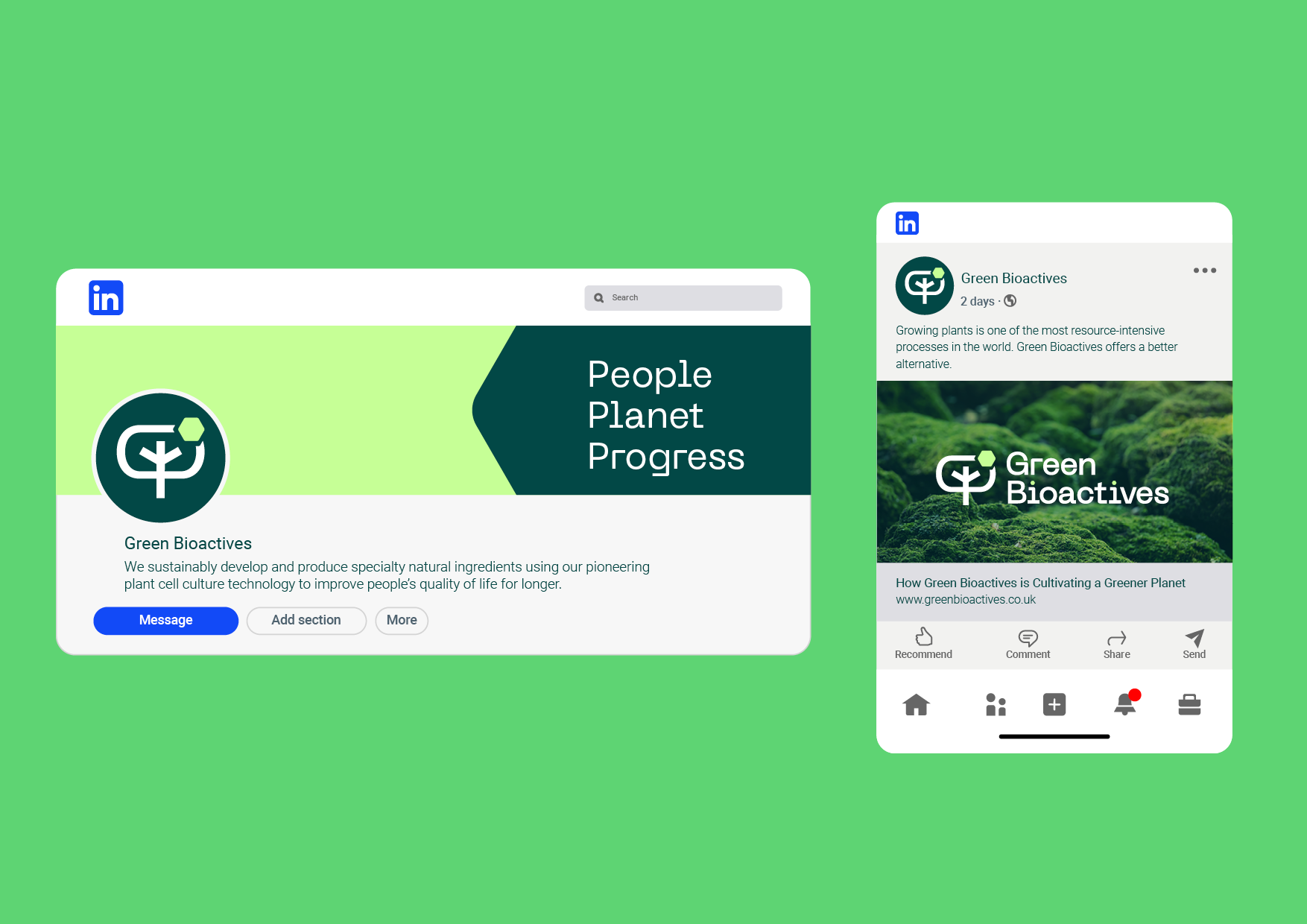
Their vision transitioned from being “a world-leading supplier” to a commitment to people. We also identified three brand pillars: People, Planet, Progress.


After the strategy workshops, there was some question as to whether the name ‘Green Bioactives’ encapsulated everything that the brand stood for. To address this we conducted a brand survey, seeking feedback from the target audience on five name options and comparing metrics like appeal and relevance.
Interestingly there wasn’t a clear-cut winner but as there were no negative associations with the name ‘Green Bioactives’ and because it was already familiar to existing customers, the name was retained.
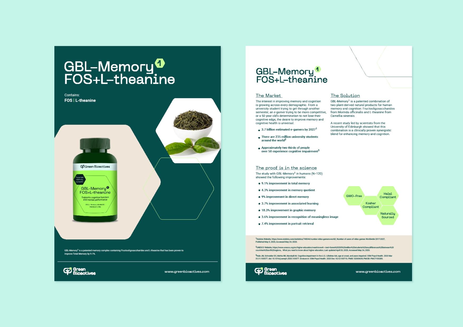
Devising a naming convention for Green Bioactives’ products was the next step. Although they would initially only be launching three products, they had plans for future additions.
The chosen system works brilliantly because it is simple, flexible and has a scientific aesthetic. It incorporates the product focus, brand name (GBL) and the active component. Plus, the exponent number increases as the number of products within a particular range (e.g. Skin) increases creating total flexibility.


With the strategy in place, it was time to bring the visual identity in line with the new vision and three pillars, creating a cohesive look and feel that was attractive to their audiences. Our interactive visual wall workshop creates mood boards that inform the style of the brand.

Former branding
Visually the branding was quite outdated. Assets were lacking in consistency with a mixture of colours, fonts and styles being used across different collateral. The logo itself was also highly detailed which meant it didn’t scale well.
New branding
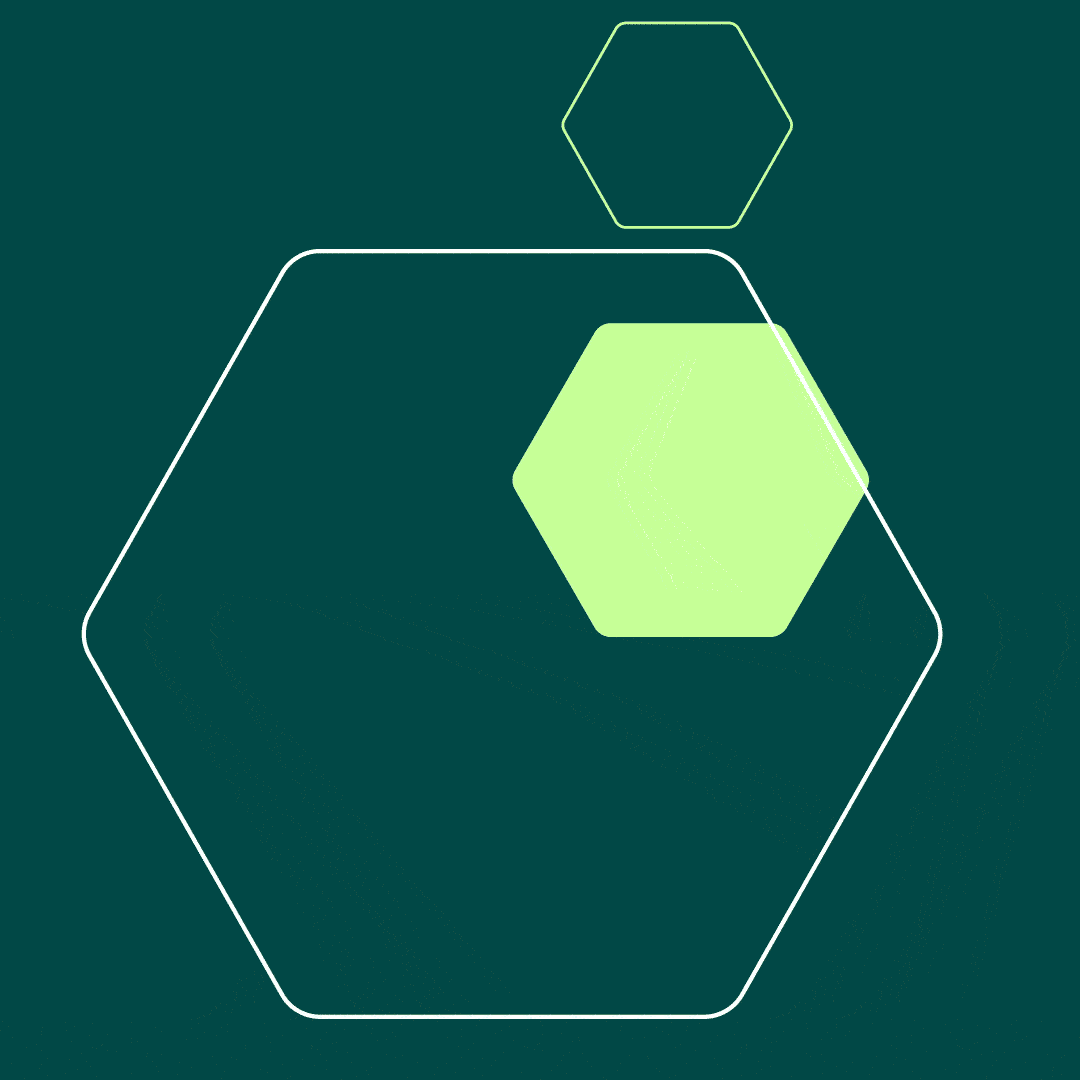
Named ‘Isolation to Creation’, the new visual identity symbolises Green Bioactives’ method of sustainably sourcing and developing ingredients directly from nature. The hexagon shape represents the extracted bioactive molecule. The tree represents nature and the three branches within the tree stand for the core brand pillars of People, Planet, Progress.


The Bioactive Chronicles


Biotechnology is a complex topic. It combines principles of biology, chemistry, genetics, and engineering. The specialist team at Green Bioactives understand it but we needed a way to simplify it for the non-scientific folk such as investors and distributors.
We came up with the idea of an illustrated comic. Each ‘Bioactive Chronicles’ episode translates mind-boggling information into simple language and beautiful visuals.


The branding has been really well received by customers, stakeholders and investors, even helping the team to secure further investment to build a new manufacturing facility so watch this space for more from Green Bioactives in the future!
We were delighted to support Green Bioactives with their launch with the deliverables including (but not limited to!): brand guidelines, social media assets, product information sheets, stationery and e-books.
“
We are absolutely delighted with the rebrand project carried out with The Loft.
We now have a strong identity that we are proud of and the feedback from customers and stakeholders has been amazing. Not only does the brand look great, we are already starting to see the effects with an uplift in inbound enquiries .”
Chris Meaney
Chief Business Officer, Green Bioactives

